UPLIFTED THC BRANDING & WEB DESIGN
–
2021
Branding Design
Web Design
Product Photography
Web Design
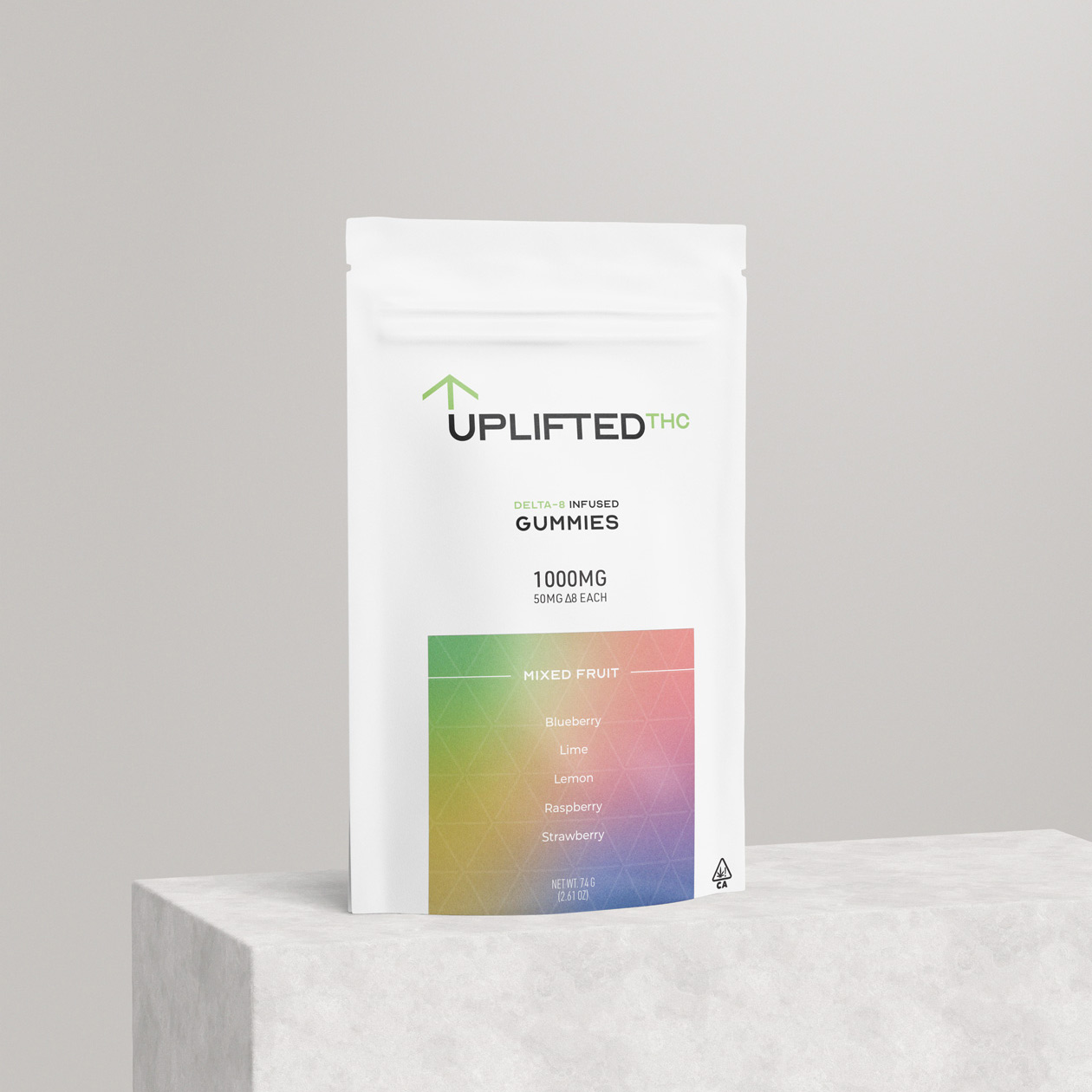
Product Photography
Uplifted THC is an emerging Sacramento-based company focused on creating quality delta-8 edibles.


A clean, modern, and simple aesthetic were key in distinguishing Uplifted THC apart from other brands that often employed less refined indentites.
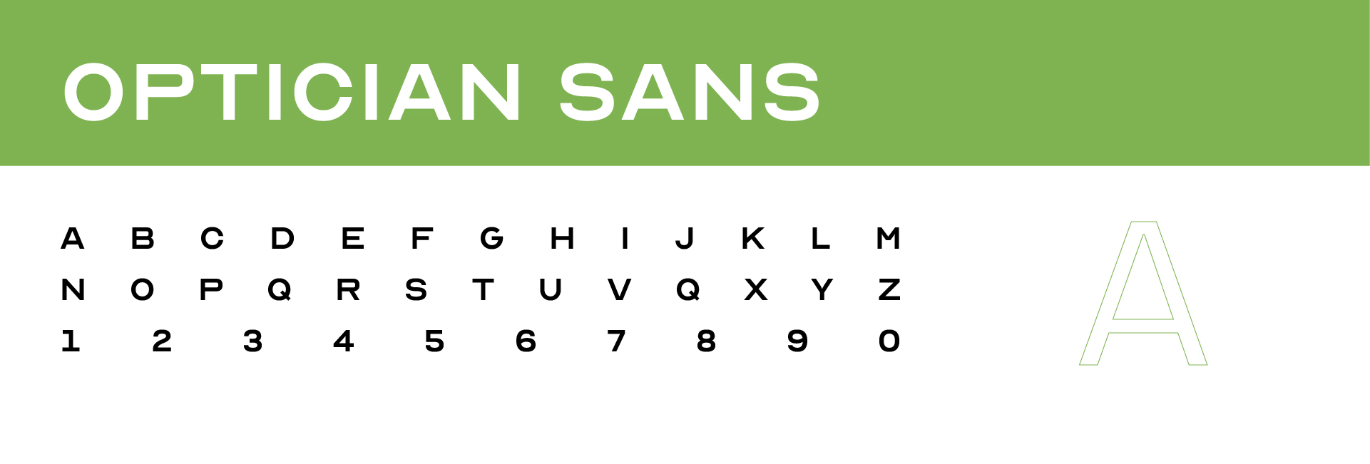
Legible and neutral typography communicates these qualities through the use of Optician Sans Regular and Montserrat Medium. The former of these typefaces is based on the historical Snellen and Sloan eye charts and optotypes used by opticians, making the logotype easy to ready and recognizable from a distance.
Alluding to the colors historically associated with cannabis, hues of green and purple build the chromatic foundation of Uplifted. The combination of these colors are not only visually appealing, but create a sense of balance and contrast.


In order to communicate the company’s values of simplicity and innovation, brand collateral must reflect visually reflect a balance of clarity and progressiveness. This is demonstrated by the uncomplicated layouts of both physical and digital mediums. Reduction of visual clutter distinguishes the brand as forward-looking as well as helps the audience interact with the brand.
The web experience serves a straightforward retail extension of the brand allowing visitors to browse and order products. Keeping visuals and layouts as clear as possible makes browsing simple and easy.
The web experience serves a straightforward retail extension of the brand allowing visitors to browse and order products. Keeping visuals and layouts as clear as possible makes browsing simple and easy.