KINJO BRANDING
–
2022
Branding Design
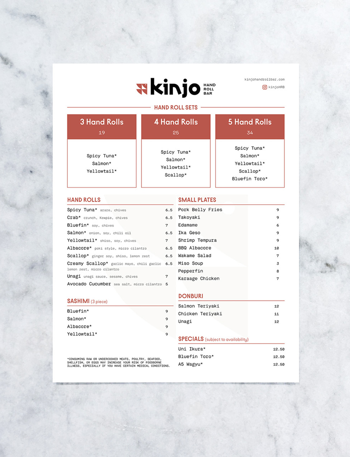
Kinjo Hand Roll Bar is a local Midtown Sacramento restaurant offering a modern and friendly sushi experience.
The goal of the branding campaign was to establish a system that guided Kinjo’s visual communications and differentiate the restaurant from competitors.
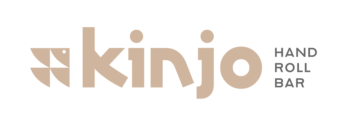
Taking inspiration from the triangular shape of hand rolls and fish fins, Kinjo’s logo-mark balances attributes of simplicity, friendliness, and quality while the typography takes visual cues from Japanese lettering. Together, these elements reflect the key qualities that define Kinjo.
Taking inspiration from the triangular shape of hand rolls and fish fins, Kinjo’s logo-mark balances attributes of simplicity, friendliness, and quality while the typography takes visual cues from Japanese lettering. Together, these elements reflect the key qualities that define Kinjo.

Primary colors are the colors that are used in the logo and wordmark. The wood brown color is inspired by the natural tones of traditional Japanese wooden architecture, communicating a sense of structure and welcomeness. The dark grey color pulls from the steel blade of chef's knives, symbolizing dedication to craftsmanship. Finally, white embodies simplicity and cleanliness.
Secondary colors of sage, sand, vermilion, and smoke are influenced by hues found in the ingredients of handrolls such as nori, scallop, tuna, and rice.
Secondary colors of sage, sand, vermilion, and smoke are influenced by hues found in the ingredients of handrolls such as nori, scallop, tuna, and rice.