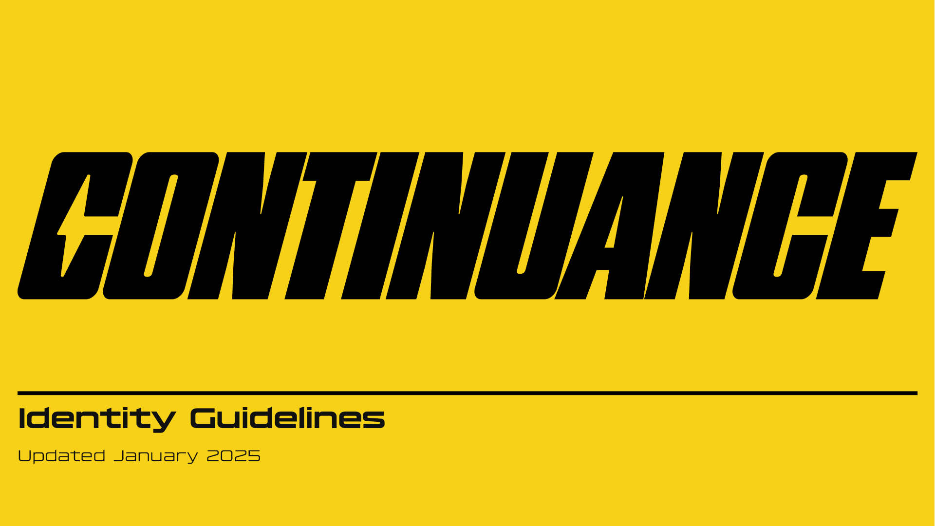
CONTINUANCE BRANDING
–
2025
Branding Design
Continuance Dance & Athletics is a Sacramento based training facility specializing in development programs and showcasing events. With expansion of the organization came the need to create a new branding system.
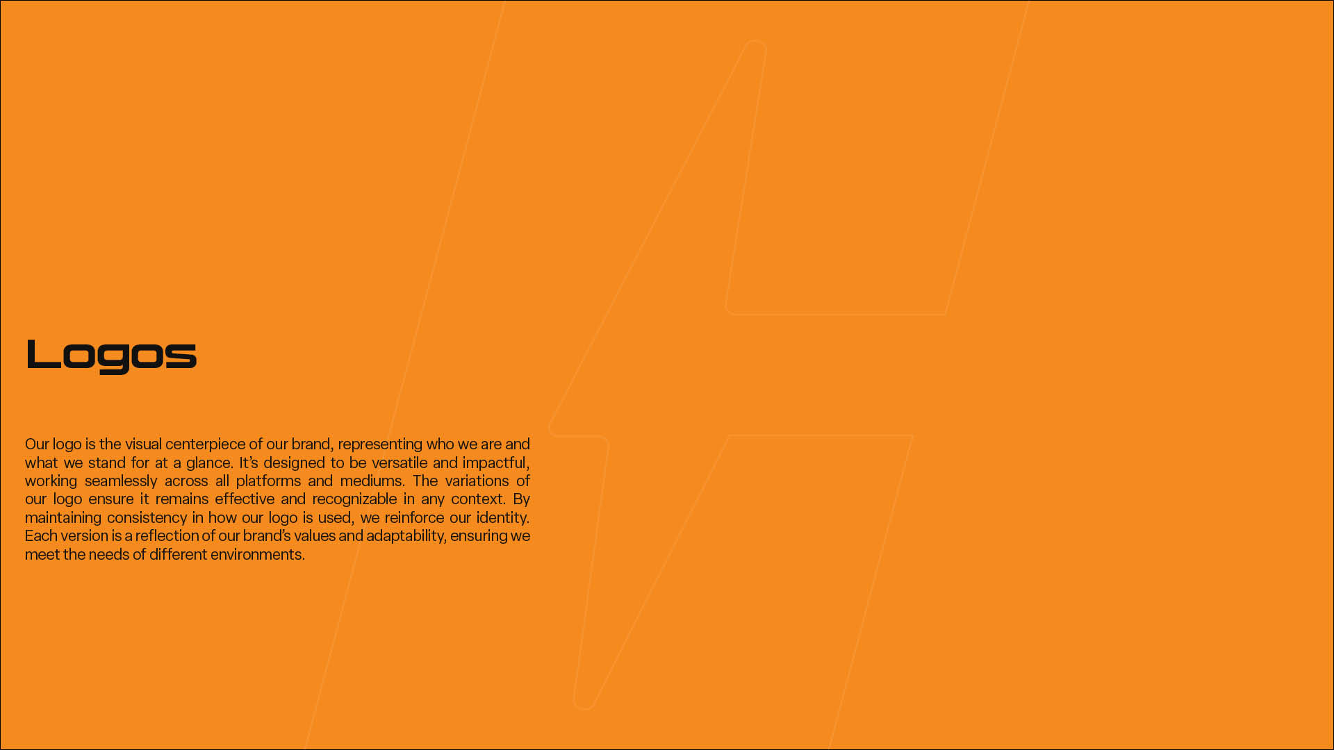
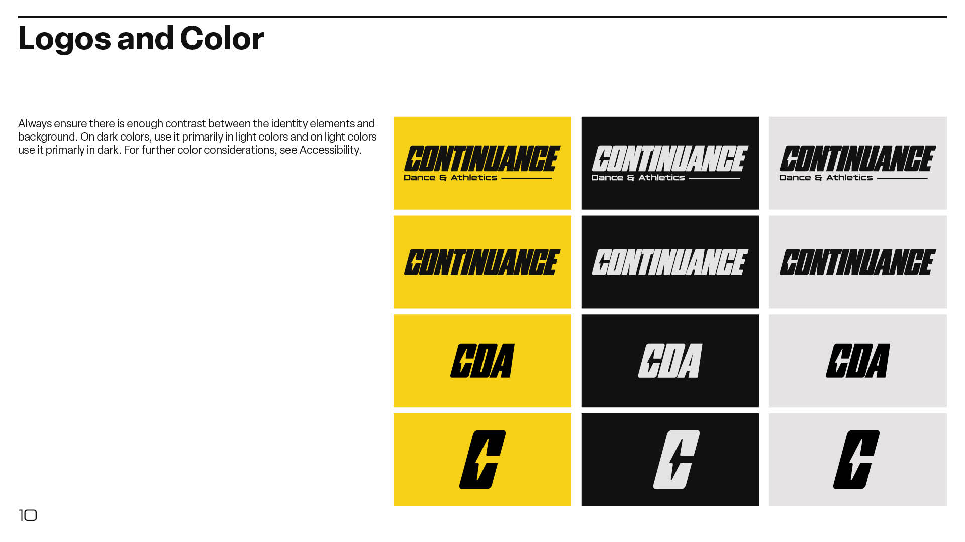
The logo is the visual centerpiece of the brand, representing the organization at a glance. It’s designed to be versatile and impactful, working seamlessly across all platforms and mediums. The variations of the logo ensure it remains effective and recognizable in any context. Each version is a reflection of the brand’s values and adaptability, ensuring it meets the needs of different environments.
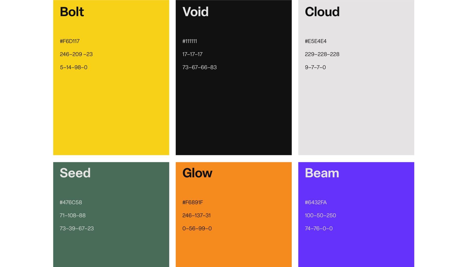
The color palette is a cornerstone of the brand's identity, helping create a consistent and recognizable presence across all touchpoints. Each color in the palette has been carefully chosen to reflect the brand’s values, evoke the right emotions, and connect with target audience. Inspired by vivid and bold energies that embody the liveliness of dance and movement, this select palette captures Continuance’s forward-thinking ethos.

Nickel Gothic Variable is a robust display sans serif typeface featuring customizable width and slant as well as flat horizontal edges. This typeface unmistakably captures the innovative and bold spirit of Continuance.
Hyperspace Race Variable is a futuristic display typeface that resides under the wordmark. Its simplicity and legibility exemplify Continuance's forward thinking.
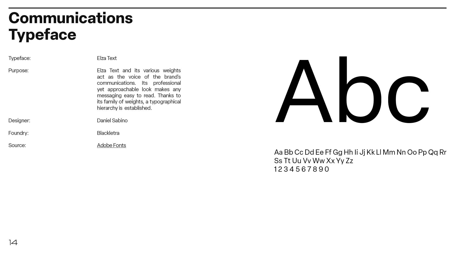
Elza Text and its various weights act as the voice of the brand's communications. Its professional yet approachable look makes any messaging easy to read.
Hyperspace Race Variable is a futuristic display typeface that resides under the wordmark. Its simplicity and legibility exemplify Continuance's forward thinking.
Elza Text and its various weights act as the voice of the brand's communications. Its professional yet approachable look makes any messaging easy to read.
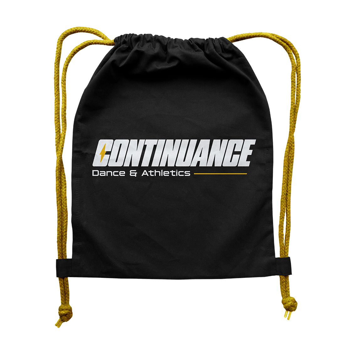

No athletic branding is complete without a gym bag and t-shirt.